When a refinement appears unchanged or drifts away from the original, the problem is often not the number of words. It is that the prompt does not separate what must stay from what must change.
The examples below are representative transformations created for this guide. They are not customer submissions. Each one shows a common failure pattern and a more testable refine instruction.
Example 1: Increase Spacing Without Redesigning CKH
Weak instruction:
Make the letters clearer.
This allows the model to change the typeface, order, or overall monogram.
Stronger instruction:
Preserve the current C-K-H order, bold stroke style, size, and horizontal layout. Increase only the white space between C and K by about one stroke width. Do not change K or H and do not add a frame.
What to verify: C remains on the left, K stays in the middle, H remains on the right, and only one gap changes.
Example 2: Make K Backwards and Tie It to H
Models sometimes interpret backwards as a different font rather than a horizontal mirror.
Stronger instruction:
Preserve C and H exactly. Mirror only the K horizontally so its diagonal arms point left. Connect the K's vertical stem to the left vertical stem of H. Keep all other spacing and strokes unchanged.
The words mirror horizontally and only the K make the operation more measurable.
Example 3: Replace Bars With an Oval Around 1888
Weak instruction:
Put 1888 in a different shape.
Stronger instruction:
Keep the numbers 1888, their current font, spacing, and horizontal alignment. Remove the straight top bar and the rocking bar. Add one thin open oval around all four numbers. Do not add any other symbols or text.
This prompt defines both deletion and addition. If an old element remains, repeat the instruction as a removal-only pass before adding the oval.
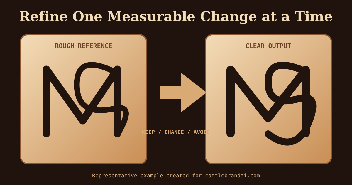
Example 4: Convert an MS Sketch Without Misreading the Letters
A sketch may look like several different characters after strokes overlap. Always label the intended letters in text.
Stronger instruction:
The sketch represents the initials M and S, not C, A, or N. Preserve the M on the lower left and the S beginning above it, with the right half of M sharing one stroke with the lower curve of S. Redraw the shaky lines as uniform black strokes. Do not invent extra letters.
For difficult sketches, first generate a clean letter interpretation. Add a rocker, bar, or frame in a second refinement.
Example 5: Add a Bee Cue Without Creating an Illustration
Weak instruction:
Add a bee element to WB.
This can produce wings, a complete bee, honey, flowers, or a badge.
Stronger instruction:
Preserve the existing WB monogram and shared vertical stroke. Add one small hexagonal honeycomb-shaped negative space inside the upper bowl of B. Do not draw a bee, wings, flowers, honey, scenery, or extra text.
An abstract cue is easier to keep compatible with a simple brand than a complete illustration.
Use a Keep / Change / Avoid Prompt
For most refinements, use this structure:
KEEP: [letters, order, layout, stroke style, and any correct modifier]
CHANGE: [one specific element and its target position]
AVOID: [elements that should not appear]
Example:
KEEP: upright K6 initials, current spacing, and bold black strokes.
CHANGE: replace only the outer circle with one open diamond.
AVOID: changing the K6, adding words, scenery, shading, or texture.
When to Start Over
Continue refining when the required letters and basic arrangement are correct. Start a new text-to-brand concept when:
- The wrong letters dominate the image.
- The composition is an illustration instead of a mark.
- Several major elements must be removed.
- You cannot describe what should remain.
If the structure is hard to describe, use the cattle brand design worksheet. For more refinement techniques, read the image-to-image cattle brand guide, then open Refine Brand.